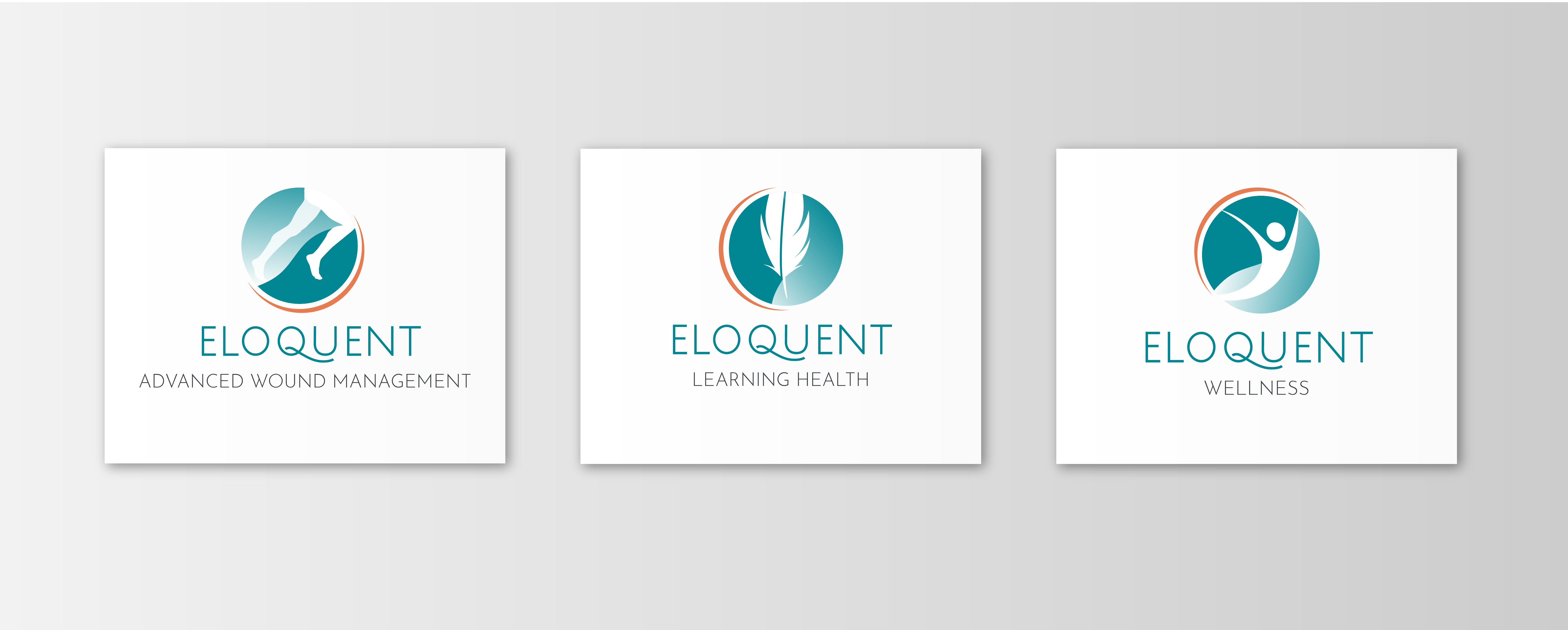
We were contacted by Liezl Naude who heads Eloquent Health and Wellness, a health and wellness center with three divisions; one providing advanced wound management, another is a training institution which focuses on wound care and management, and the last is dedicated to holistic health and wellness.
Liezl approached us primarily to re-design Eloquent's logo and branding material.
At our meeting, Liezl showcased the centers existing logos where she mentioned that they were too busy visually. Liezl wanted a cleaner, simpler and more modern look that would communicate the Centers core values and divisions more effectively.
Liezl requested that we retain the original symbolism in each logomark, as each had significant meaning and she wanted to ensure that existing audiences can still effectively identify the center.

We conducted brand analysis and identified the following core values for the Eloquent Health and Wellness brand; innovative, knowledge, empowerment and simplicity.
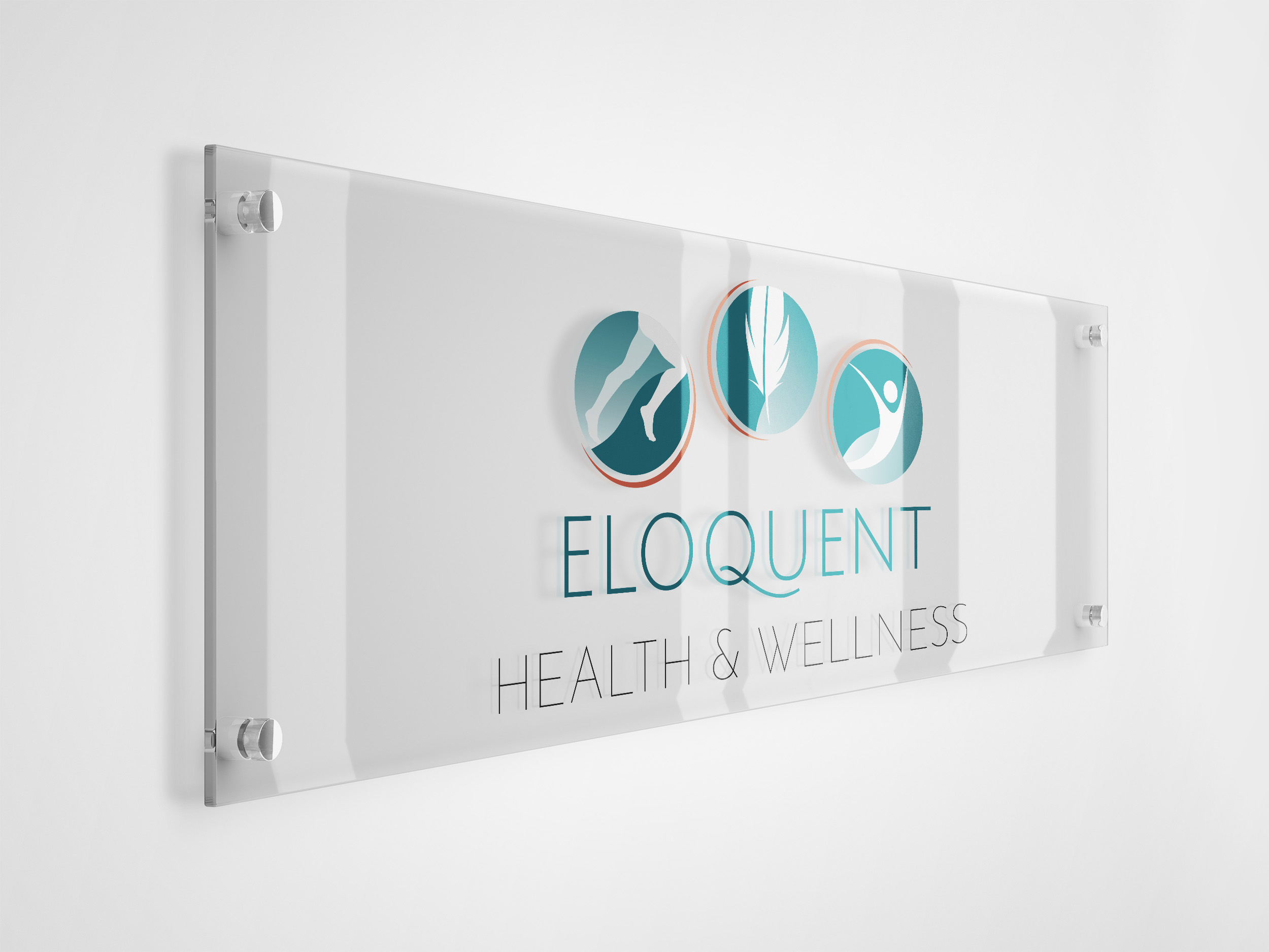
We re-designed the logo, combining each divisions symbol into a single logomark, that could also be split up individually, to represent each division. The symbols were simplified and modernised per the project brief. An opaque curved shape, reminiscent of a yin yang, was used behind each symbol to denote complimentary forces, a nod to each division working in unison, and the orange arc outlining each logomark symbolises a sunrise and new beginnings. The primary logo colours are teal, which represents emotional healing and initiative, and orange which represents warmth and enthusiasm.
Once we had completed the re-design of Eloquent's logo's we re-designed all branded materials, including business cards, letterheads, prescription pads and onboarding forms, where both print-ready and interactive online versions were provided.

