Invetec operates within the field of telecommunications, where it's aim is to act as a group structure, with subsidiaries in a range of of new and exciting fields within the tech and telecommunications sectors.
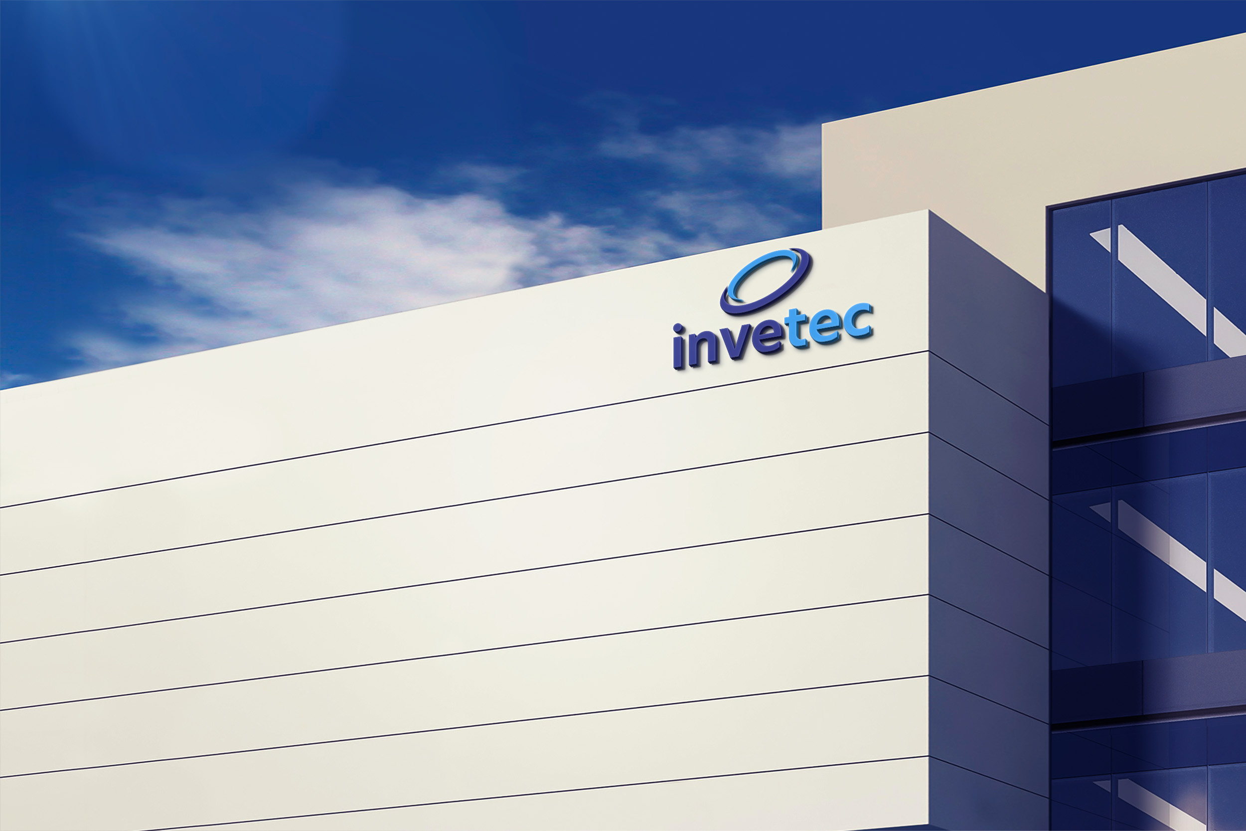
Invetec approached us to design and develop their brand identity, logo and corporate stationary. In our initial meetings, it was expressed that the new brand identity should have a modern look and feel, whilst encompassing values of innovation, strength, power and professionalism. Invetec wanted a brand identity and logomark that captures the company's pioneering spirit and commitment to building meaningful and lasting relationships with the individuals and entities they work with.
We then held an in depth brand analysis meeting wherein we conducted brand exercises to surface invetec's core values as a brand. The core values identified during this meeting were summarised as approachable, adaptable, trustworthy, innovative and creative.
To effectively represent Invetec’s core values and broader strategic goals we needed a symbol that would be both relevant, in terms of Invetec’s current focus on telecommunications, and all-encompassing, in terms of it’s desire to expand into numerous tech related fields and industries where new technologies would play a vital role. To this end we decided on utilising the symbolism of an electron.
Why an electron? Electrons are the lightest stable subatomic particle known, by working together they create a negative charge that balances the positive charge of the protons in the atomic nucleus.
They create structure to what would otherwise be chaos. They are dynamic, continuously moving, adaptable, vast and boundless. Without electrons, there would be no atoms - the nuclei would become unstable and split apart as protons repel each other. In other words, without electrons, matter would cease to exist as we know it. Without access to vital resources and technologies, life as we know it would cease to exist. Invetec is the force that dynamically connects us to those possibilities.
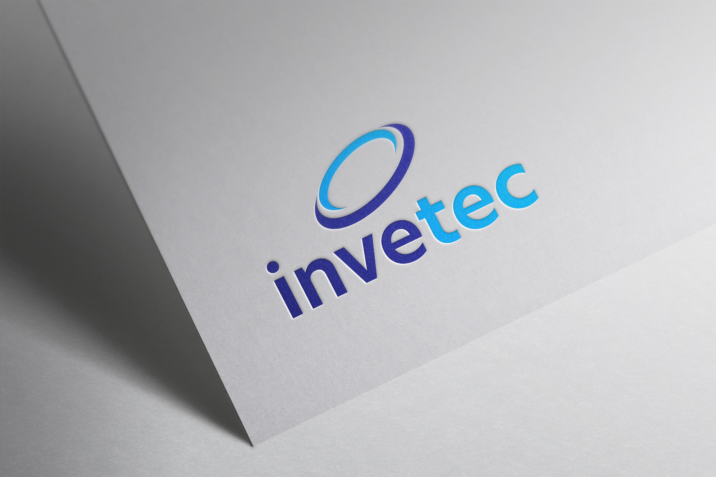
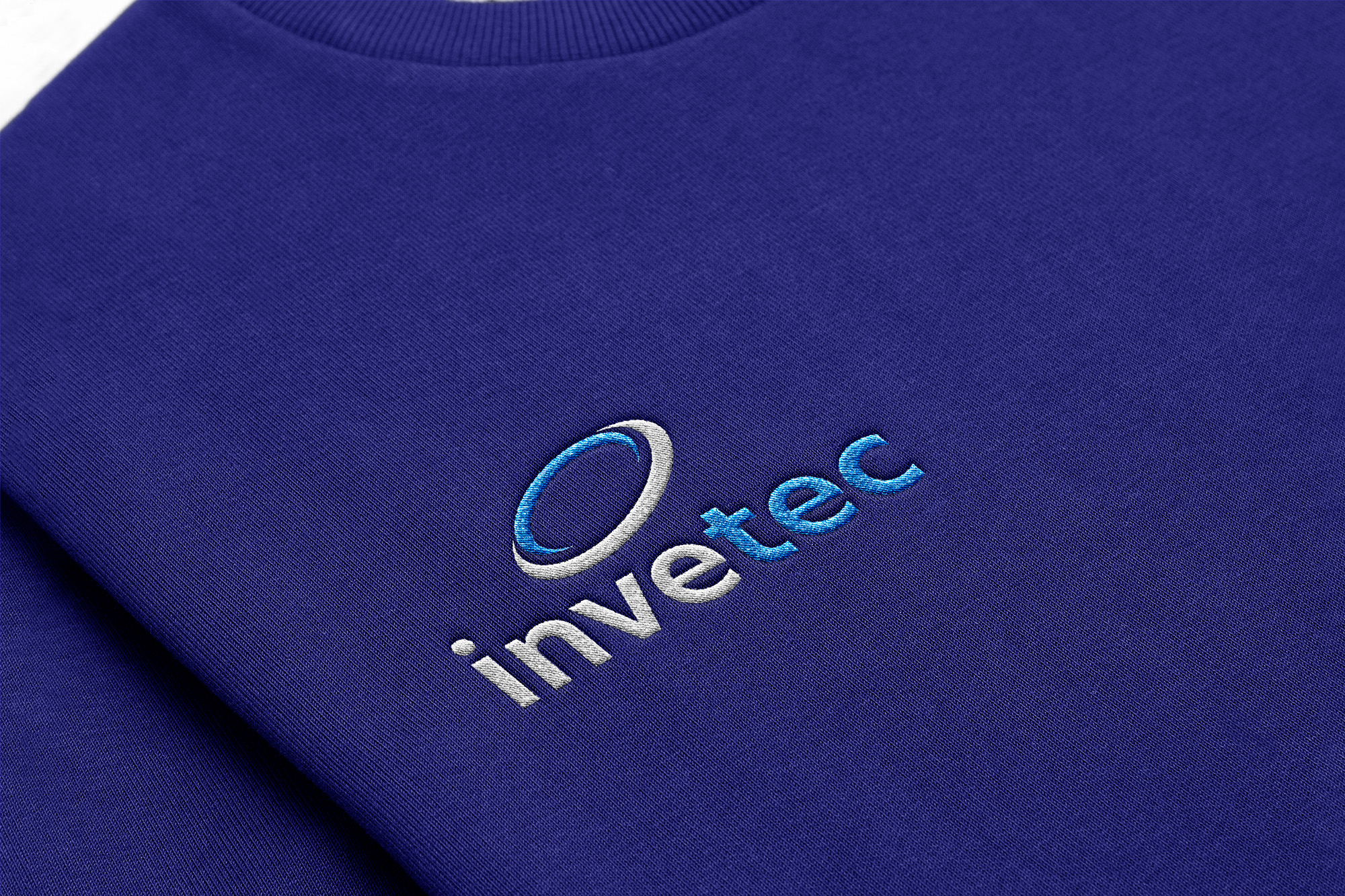
We took an abstract approach and focused on the broader electron field (as representative of electrons working in unison). There are two “electron fields” nestled into one another to emphasis Invetec’s ability to work in close coordination with others when bringing their clients ideas to life.
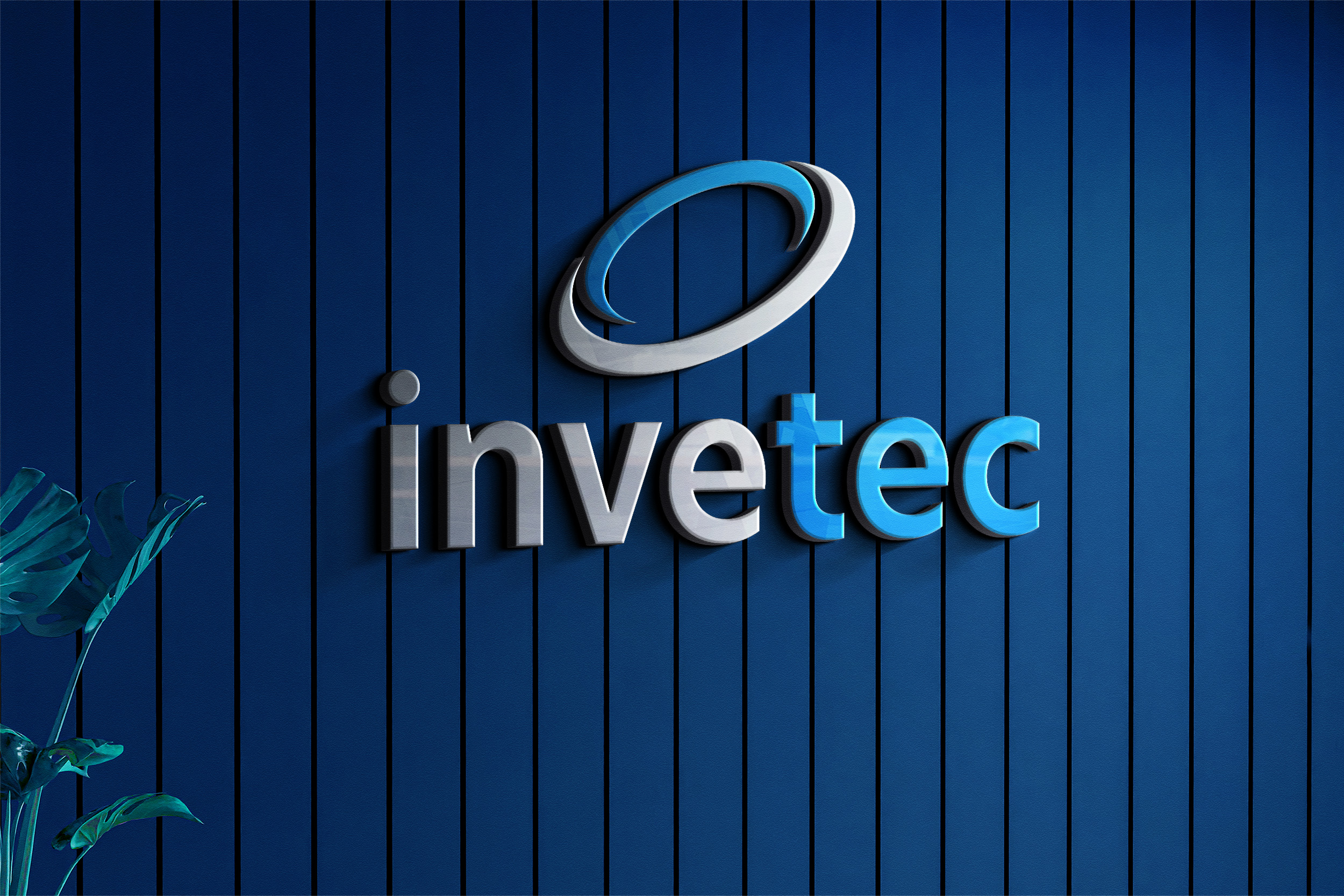
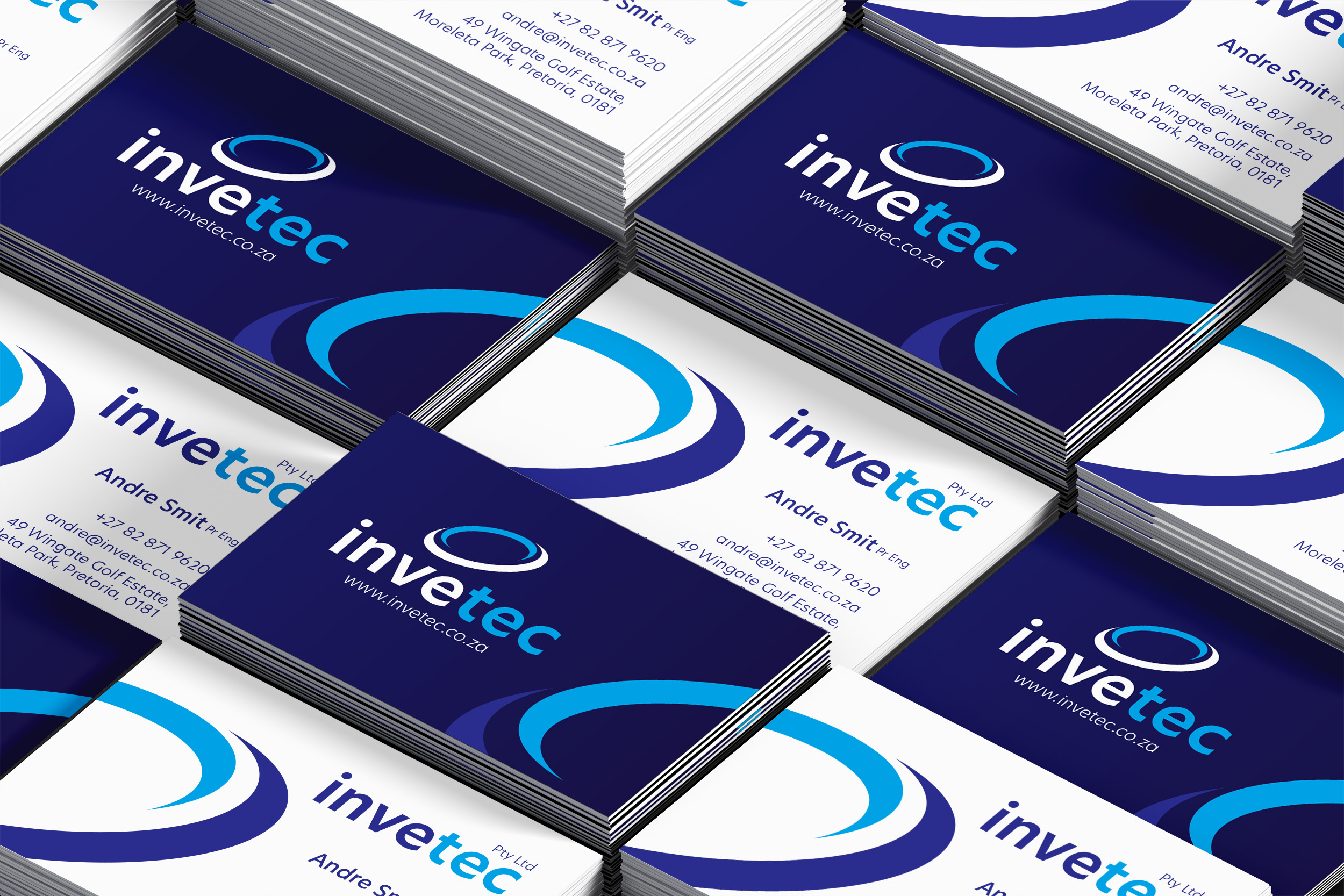
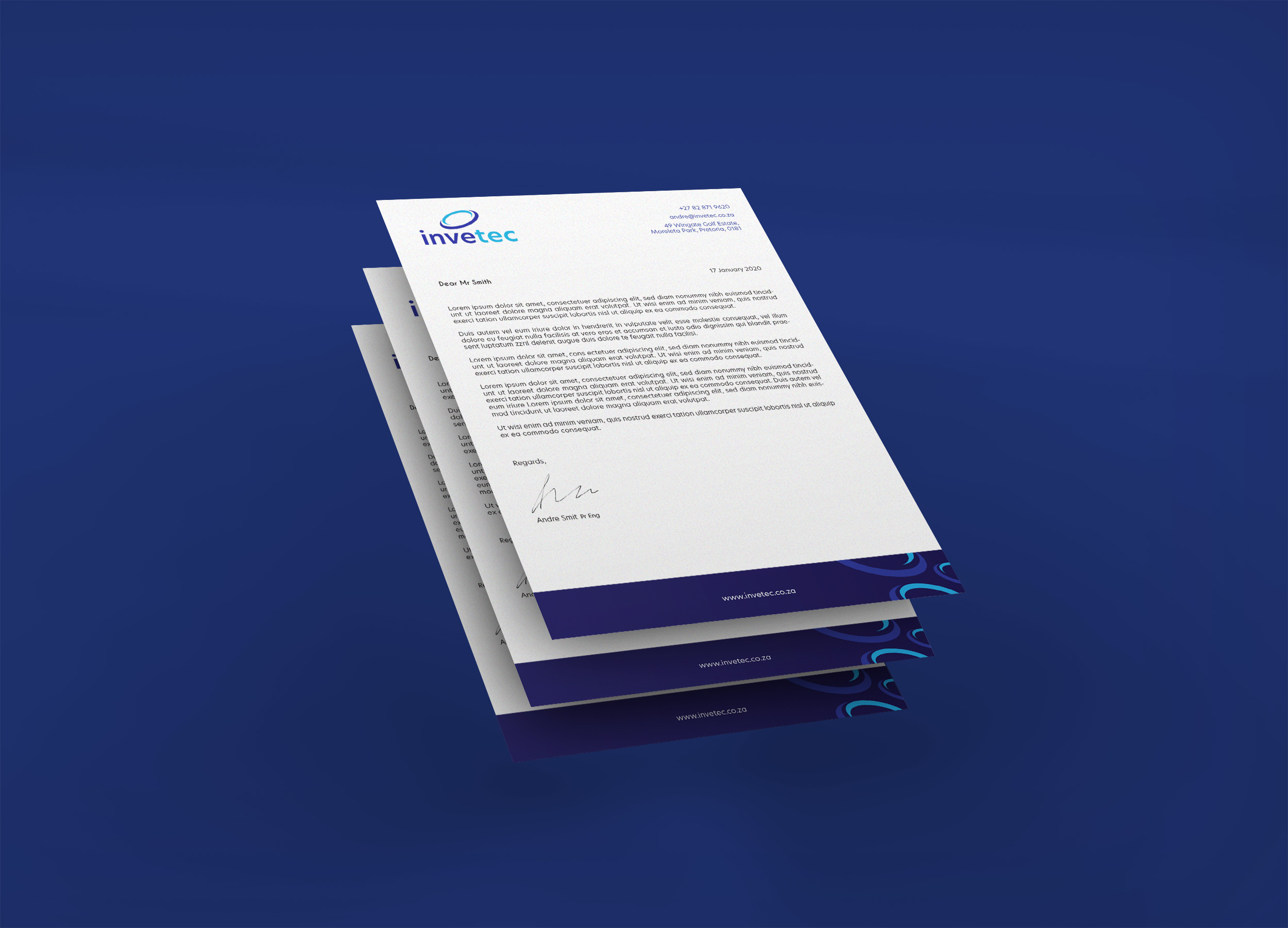
Dark Blue emphasises Invetec’s inherent power, whilst communicating core values of trust and authority, whilst the Bright Blue accent reflects a creative and intuitive brand full of budding energy.
We chose New Hero as the typeface for the logotype, it is described as a powerful, clean and crisp geometric sans-serif dedicated to civic duty. This is showcased in lowercase letter-forms to emphasise approachability and open-mindedness.