Special Ops Gear International provides combat and tactical gear and equipment to clients within the Global Special Ops Industry.
Special Ops Gear International requested we re-design their logo, as their old logo had become outdated.
Their original logo was very basic and consisted of 4 black blocks arranged in a square with the company's initials centered within each block. Equally the typeface used in their logotype was quite non-descriptive. The main issue was that the logo as a whole had no signifiers that would help customers understand their business beyond the name itself.
We began by re-designing their logomark. We retained the layout of the original logomark (in terms of the companies initials) and loosely incorporated the markings you'll see when looking through the scope of a rifle or sniper gun as a nod to the industry in which the company operates. We introduced a vibrant red to the companies original black and white logo colour combination, the colour red denotes excitement, passion, danger, energy, and action.
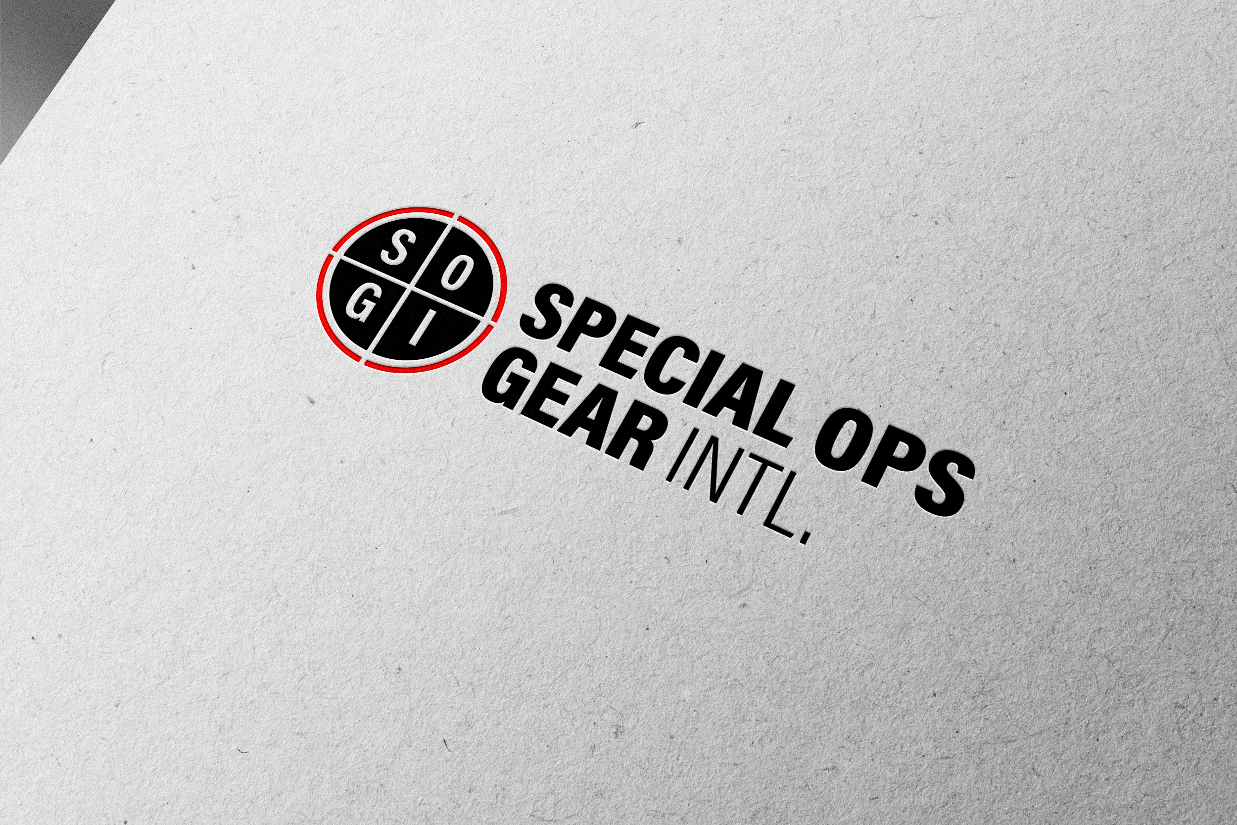

We used Acumin Pro (Condensed) as the typeface for the logotype (in both Black and Light weights), Acumin Pro is a versatile sans-serif typeface family intended for a balanced and rational quality. The heavy weight in the first three words of the company name emphasises it's purpose whilst conveying concepts of power and masculinity. The condensed nature of the typeface denotes control and order.

