Swarisa Property Services has been in the electrical industry for more than a decade, providing a range of electrical services to both domestic and industrial property sectors. They then expanded to provide potential homeowners with the possibility of installing solar in the event of buying a house.
We were originally contracted to design their presentation detailing their new offering to a prospective investor. We also designed an accompanying Tri-fold company brochure that they could distribute to members after the presentation had concluded.
.jpg)
.jpg)
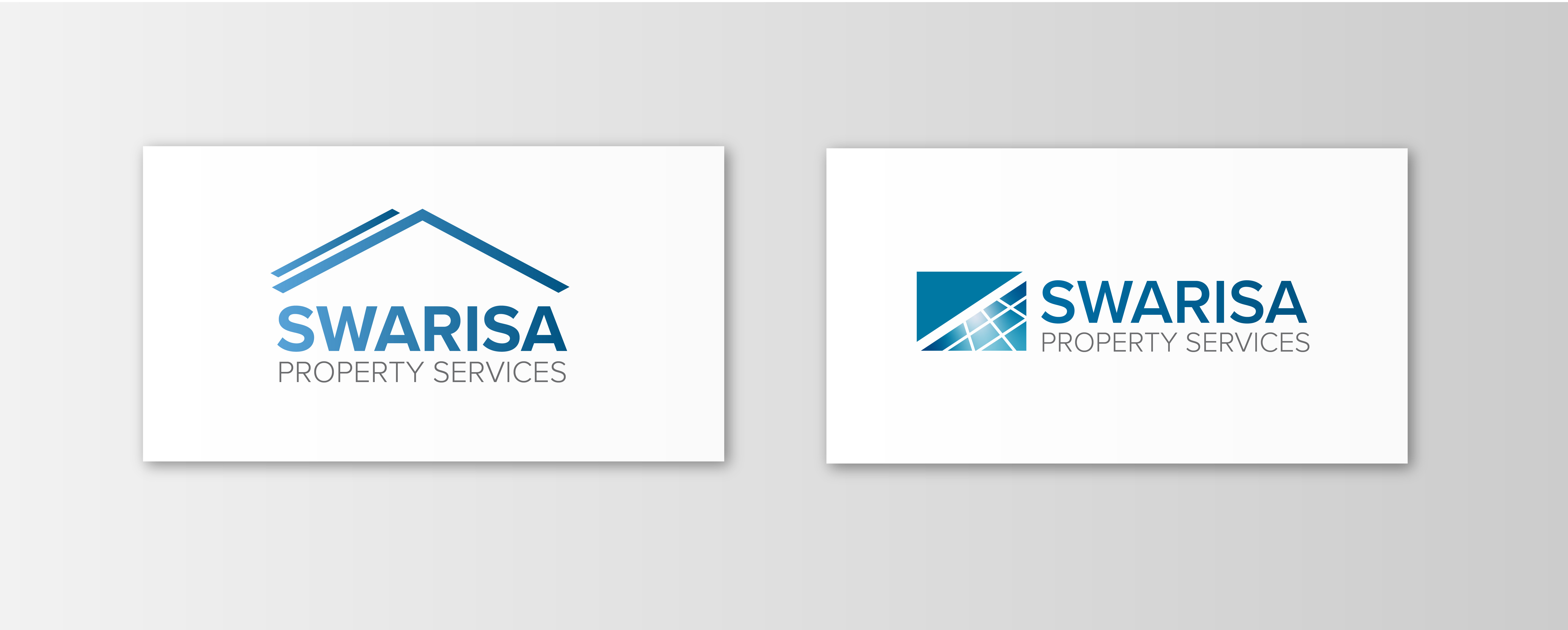
Mike then requested that we update their logo, as he felt it's look and feel did not reflect the business's core values, which can be described as clean, trustworthy, reliable and intelligent.
We designed four logo options in total. The first two stayed true to the main components of the original logo, we simply cleaned up the letter forms and visual elements. The idea was to retain as much of the original logo as possible, this to ensure stakeholders can easily recognise the main logo forms in the updated version.
The original brand colours of yellow and turquois were replaced with a bright sky blue (encompassing values of trustworthiness and honesty) which was combined with tones of royal blue (which conveys values of intelligence and sophistication).
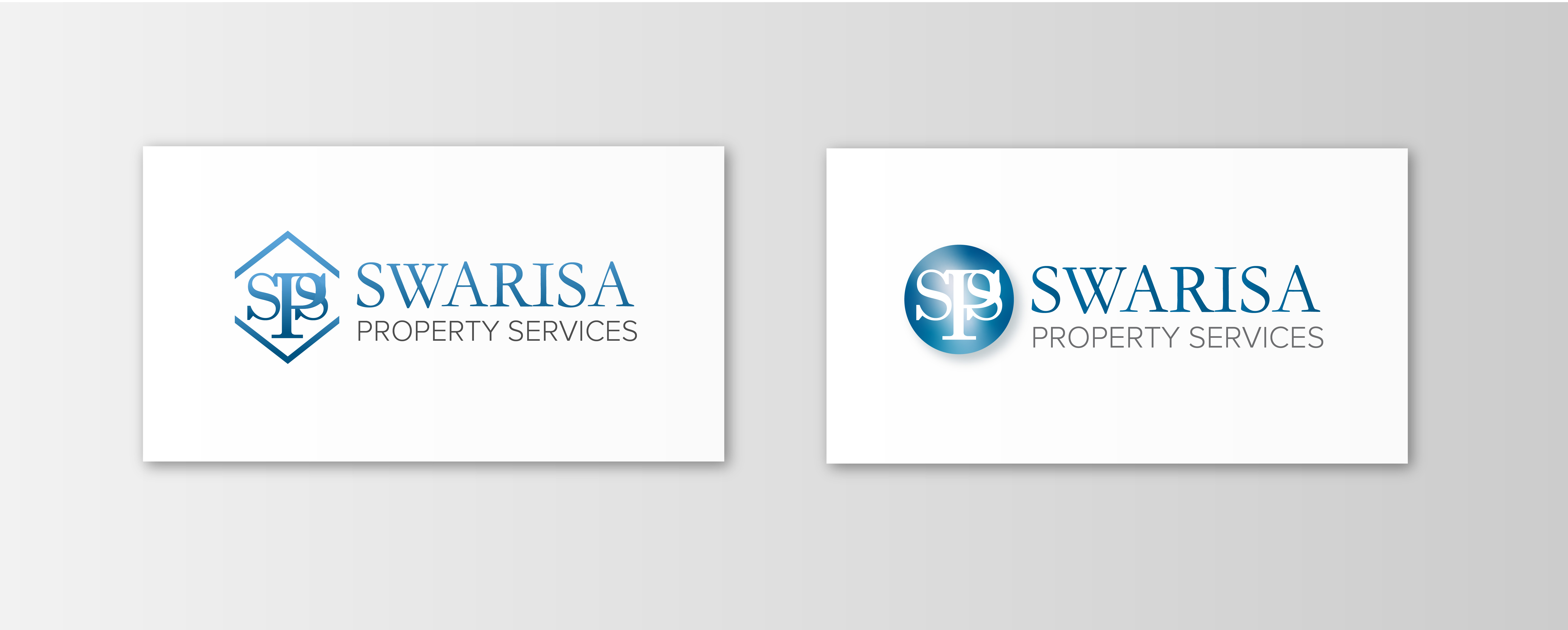
The third and fourth options involved a full re-design. The typeface for the word “Swarisa” was changed to a modern and impactful sans-serif font. We also created a simple and modern logo mark that is reminiscent of a roof with a solar panel on it, this to more accurately reflect the business’s services in terms of household solar installation and other household maintenance solutions.