Rainer and his wife Wallie have run Zur Alten Mine Guest Farm since 2007. The Guest Farm is situated at the foothills of the stunning Mpumalanga escarpment and promises a quiet getaway from the hustle and bustle of city life. Zur Alten mine promises clean, comfortable and affordable accommodation that is surrounded by breath-taking natural views and indigenous forests.
We originally approached Zur Alten Mine to discuss their options in terms of the re-design of their website. Rainer expressed concerns that their website had become outdated in terms of both look and feel and responsiveness. He also mentioned that he’d like their logo to be cleaned up and modernised.
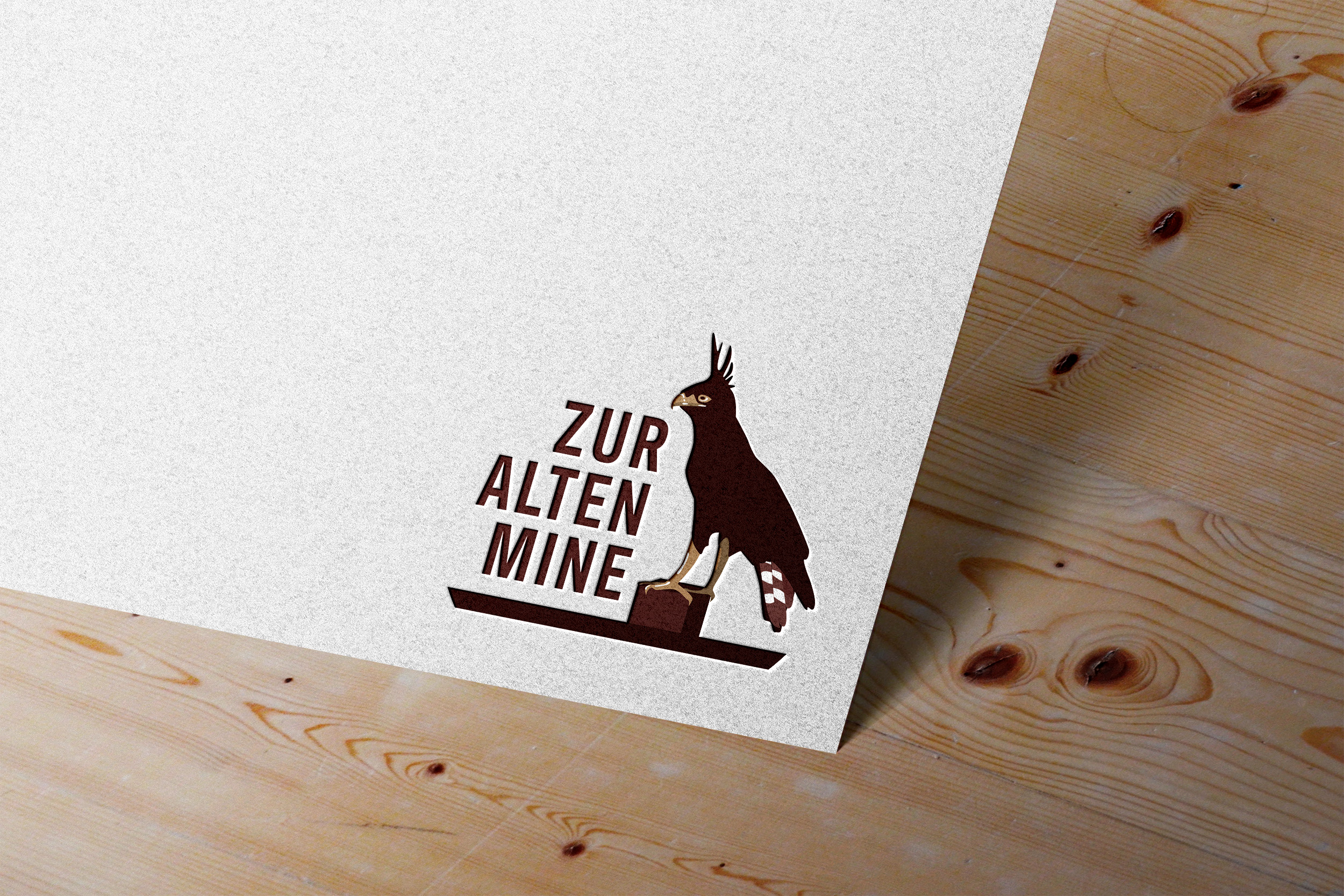
We began with updating and modernising Zur Alten Mine’s logo with the aim of improving both it’s readability and overall visual appeal.
Their existing logo was designed by Rainer’s uncle who originally owned and ran the guest farm. The Logo depicts the crested eagle who resides in the area and is still seen today, perched on a sign at the farm. Rainer expressed that the logo simply required some cleaning up. He wanted the main elements of the original logo to remain as is, in terms of the depiction of the crested eagle perched on the sign, whilst he was happy to change the typeface to something more modern and impactful.

We were able to surface a number of core values from our discussions with Rainer about the business as a whole and how he came to own it, we also visited Graskop to gain a holistic view of the guest farm and all that it has to offer.
The core brand values identified during this process included down-to-earth, simplicity, comfort, dependability and tradition. We selected brown and beige as his new brand colours, where brown conveys Stability, Reliability and Honesty, whilst beige conveys Tranquility, Comfort, Simplicity and Modernism.
We re-designed the logomark, using the crested eagle perched on a sign as requested. We combined this with Antartican Headline for the logotype, an impactful and fresh typeface with a foundation in historical navigation companies.


We then turned our attention to the re-design of Zur Alten Mine's website. The original website was quite extensive, with 9+ informative pages detailing the history, accommodation facilities, pricing, activities, contact information, maps and directions for the guest farm. Whilst the original website was incredibly informative and helpful, it was also quite convoluted and lacked in terms of user and mobile friendliness. The overall look and feel had also become quite outdated. The guest farm had also undertaken renovations since the launch of the original site, and had expanded to include additional cottages and facilities.
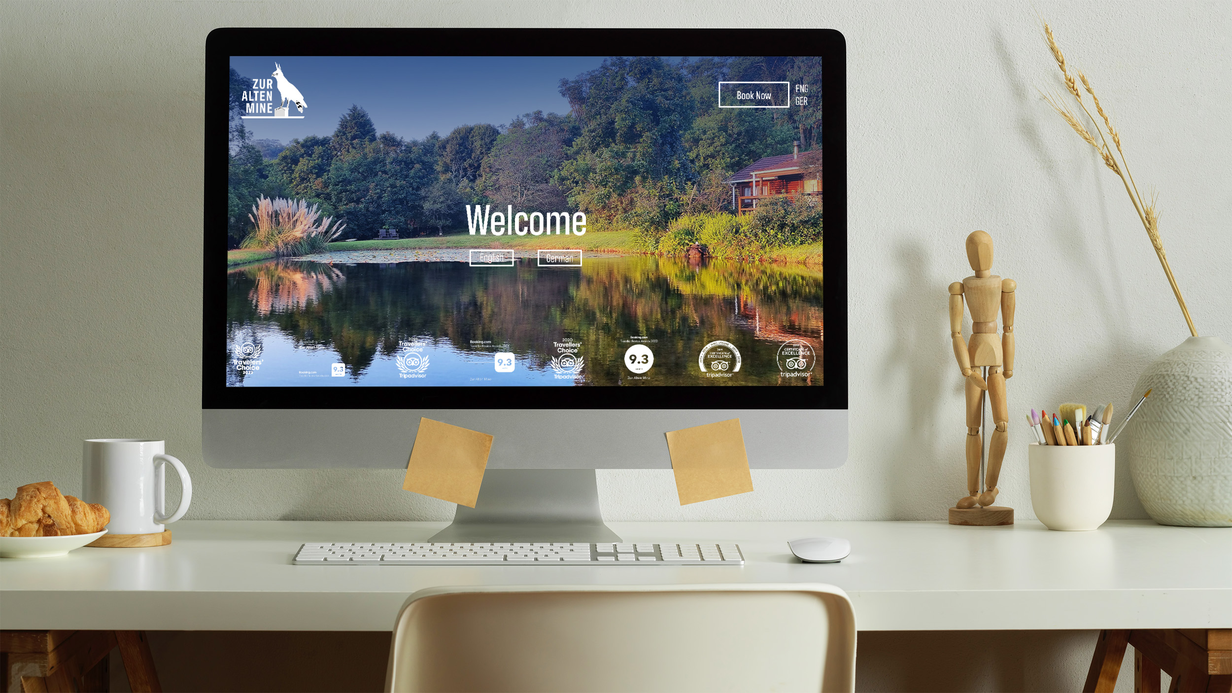
When re-designing Zur Alten Mine's website we focused on streamlining the information so that it was more concise and punchy. We reduced the number of pages down to 6 and overhauled the look and feel of the site. We photographed the grounds, facilities and units so that we could focus on showcasing high quality images that capture the spirit of the property. We focused on a modern and simple layout which would encompass Zur Alten Mine's core values (down-to-earth, simplicity, comfort, dependability and tradition), whilst retaining the informative nature of the original site. We also re-worked and added to the websites existing copywriting to improve readability and overall user experience. All pages were also translated into German, as a large portion of Zur Alten Mine's client base in German speaking.
View Zur Alten Mine's website.jpg)